A home base for hackers
LA HACKS • SHIPPED 2023
ROLE
Product Designer
TIMELINE
Sep - Dec 2022
(3 months)
TEAM
5 Designers
4 Engineers
SKILLS
UX Design
Brand Design
Content Design
OVERVIEW
LA Hacks is the largest hackathon in Southern California hosted at UCLA, providing free of charge experiences to students interested in tech. Serving as the design director, I led a team to create 3 separate applications for the hackathon.
THE PROBLEM
Hackathon signups are decreasing
The current sites did not highlight the key value propositions of LA Hacks, leading to significantly less participant and sponsor interest than prior years, nor did they demonstrate much visual interest.
We needed to answer three core challenges:
How might we lower the barrier to applying, especially for beginners?
How might we clearly communicate what differentiates LA Hacks from other hackathons?
How might we create a memorable visual identity that feels welcoming rather than daunting?
LA Hacks 2022 about page, text heavy and dense
2022 hackathon day-of schedule static graphic
RESEARCH
Understanding our audience
I interviewed hackathon attendees to receive feedback from past LA Hacks events, ranging from hackathon veterans to first-time applicants with no prior exposure.
USER SENTIMENTS
"I started a few hackathon applications but only finished the ones that felt quick and straightforward. If it takes too long, I usually give up halfway." — UCLA 3rd year undergraduate, LA Hacks attendee
"Most hackathon sites look the same. If I can’t immediately tell what makes this one special, I just assume it’s like every other event." — High school hackathon winner, LA Hacks attendee
"The design definitely affects whether I trust the event. A polished site feels more legit and welcoming." — Stanford 1st year undergraduate, LA Hacks attendee
KEY INSIGHTS
EXPLORATION
Solution 01: One column landing page
We explored a single-scroll landing page that presents all key information without forcing users into subpages and designed the application as a separate, focused flow, allowing users to learn about LA Hacks before committing.
We also added multiple application entry points across the site to minimize friction.
Solution 02: Removing unnecessary cognitive stops
We shortened the application form and removed unnecessary steps, as well as allowing enabled users to save progress on their applications.
We avoided pop-up signups in favor of a clean, dedicated sign-in flow, and mapped post-submission states (login errors, acceptance, rejection) in collaboration with developers.
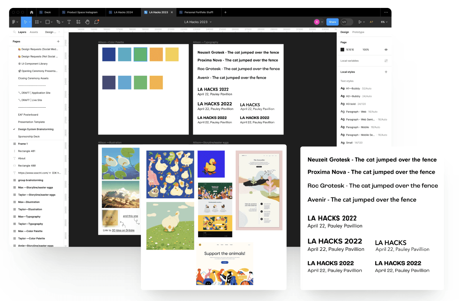
Solution 03: Improved Design System & Visual Language
We built reusable components and form states in Figma and select MUI React components for development efficiency.
We developed a bright, playful palette and illustration system aligned with the “coming home” theme.
ITERATIONS
Experimenting with grid styles
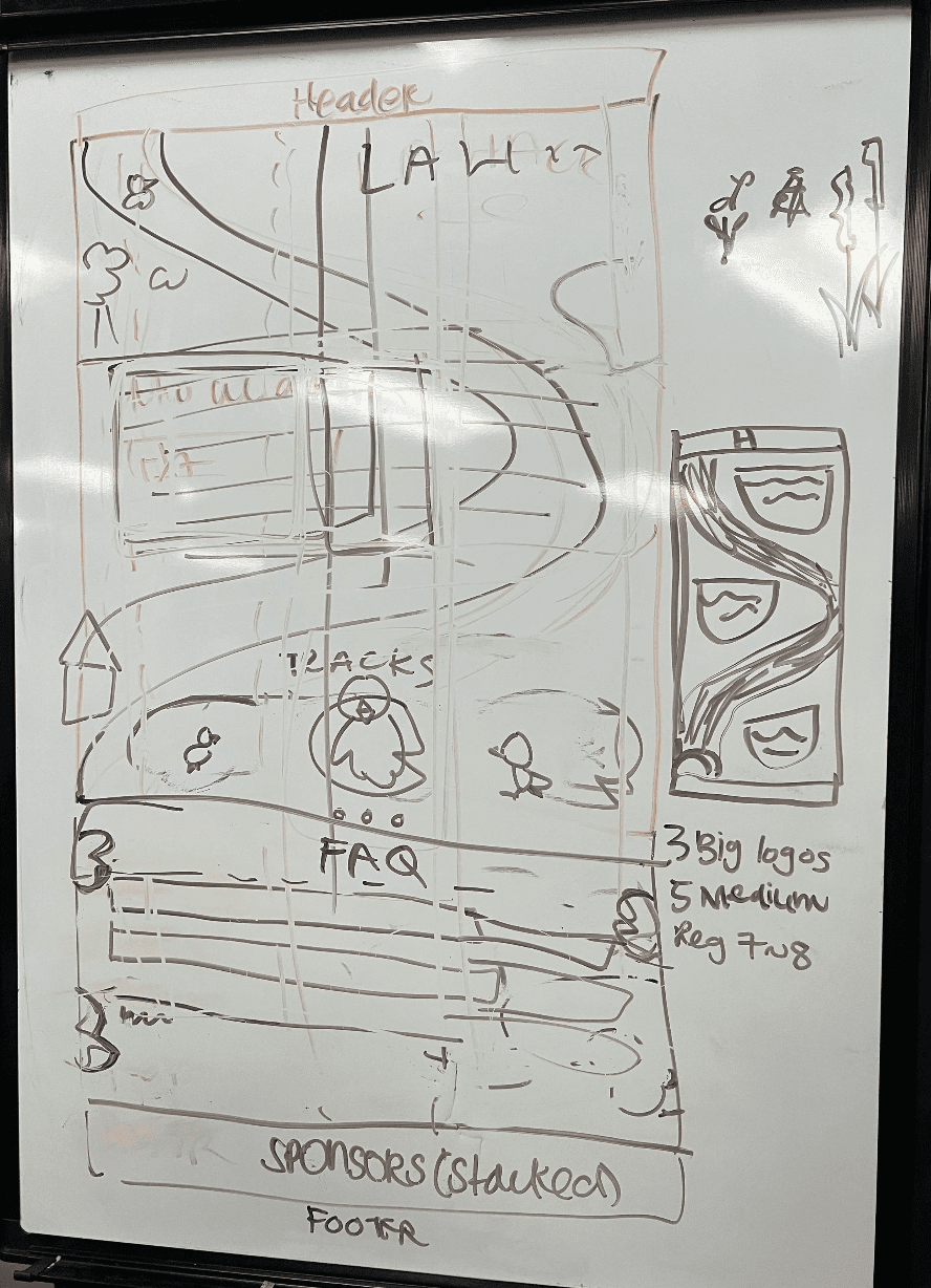
To move forward with these solutions, we experimented with different grid styles and design variations.
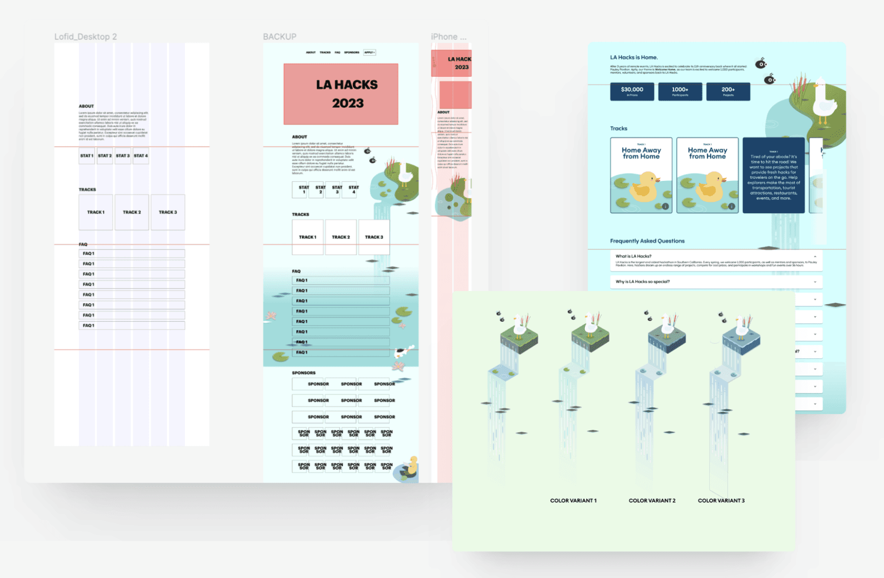
Developing a visual identity
We continued to develop the visual identity of LA Hacks, aiming for a fun and playful look.
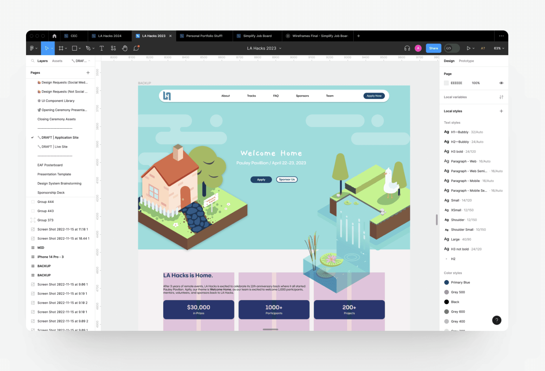
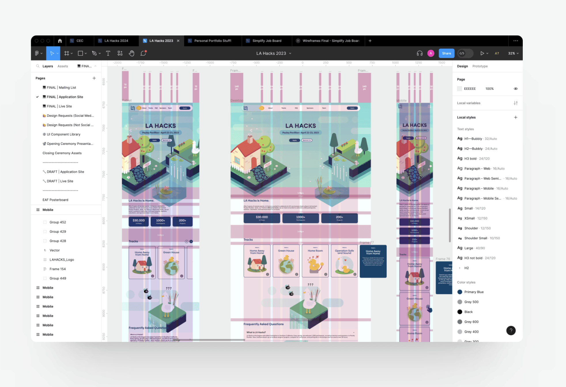
FINAL SOLUTION
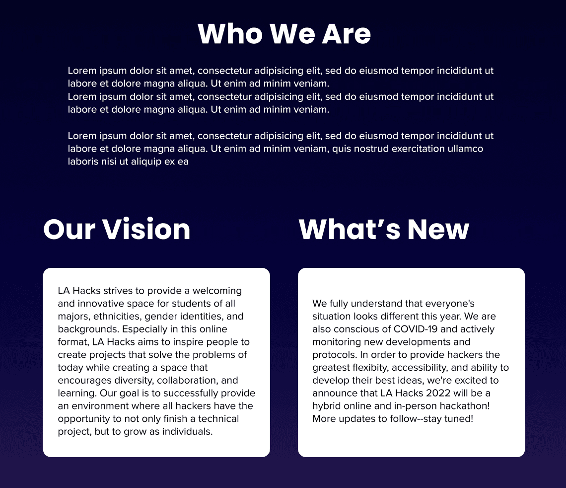
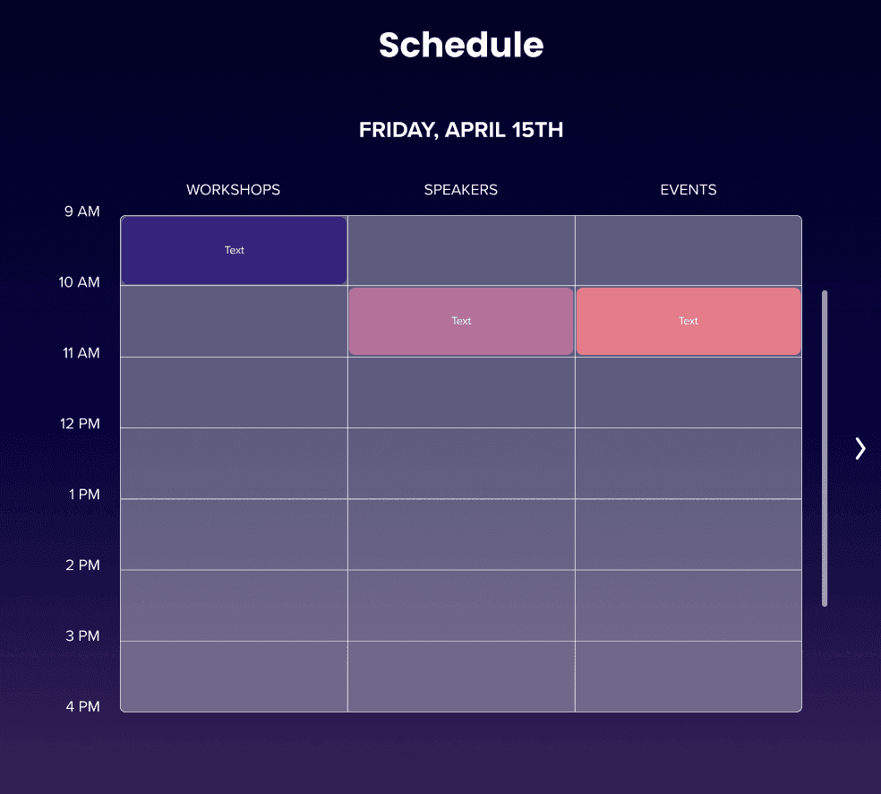
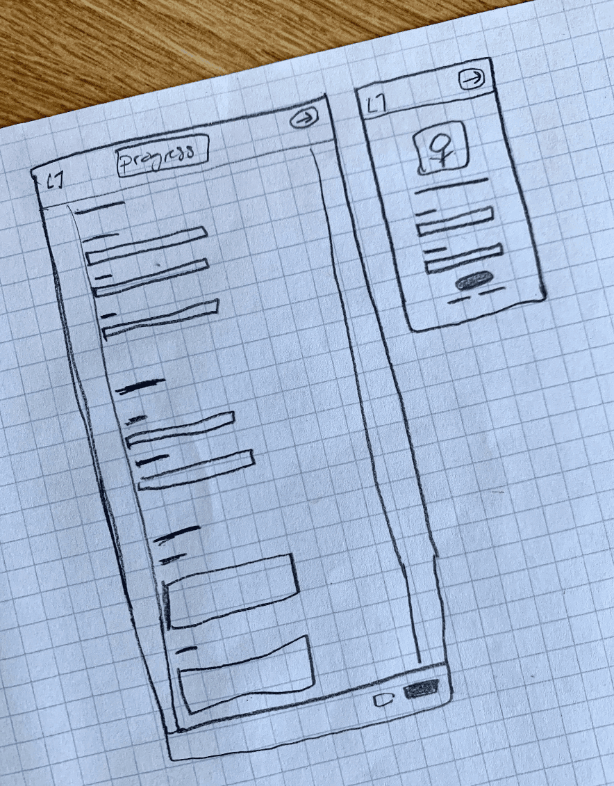
A comprehensive and informative experience for users
For hackers to receive appropriate information on the event, as well as being able to communicate with organizers, we designed a smooth live page and home page experience.
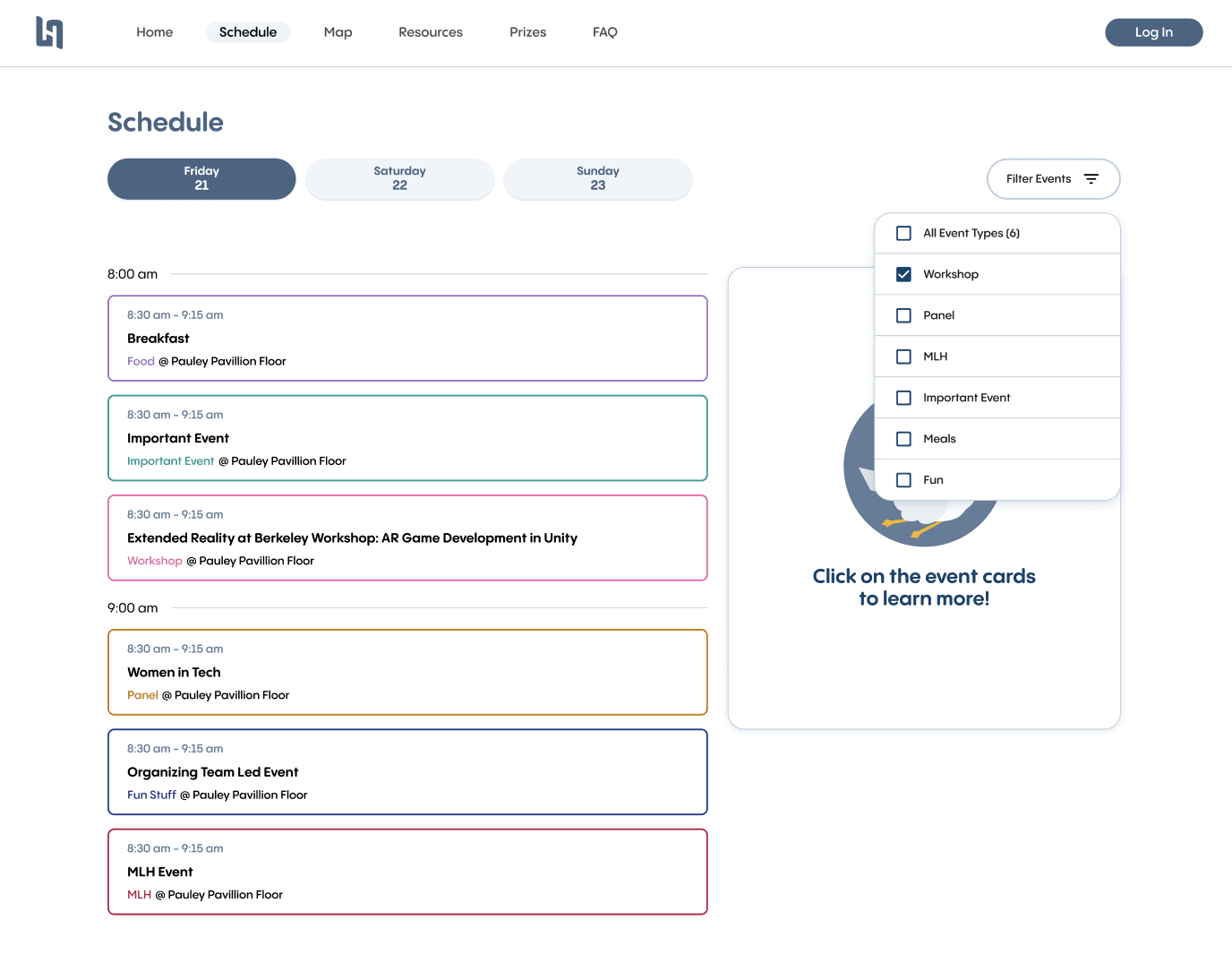
Schedule page on day-of hacker site
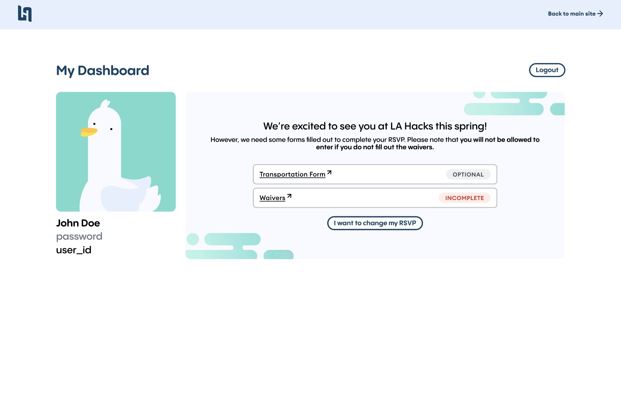
RSVP UI for user to indicate state and upload current forms
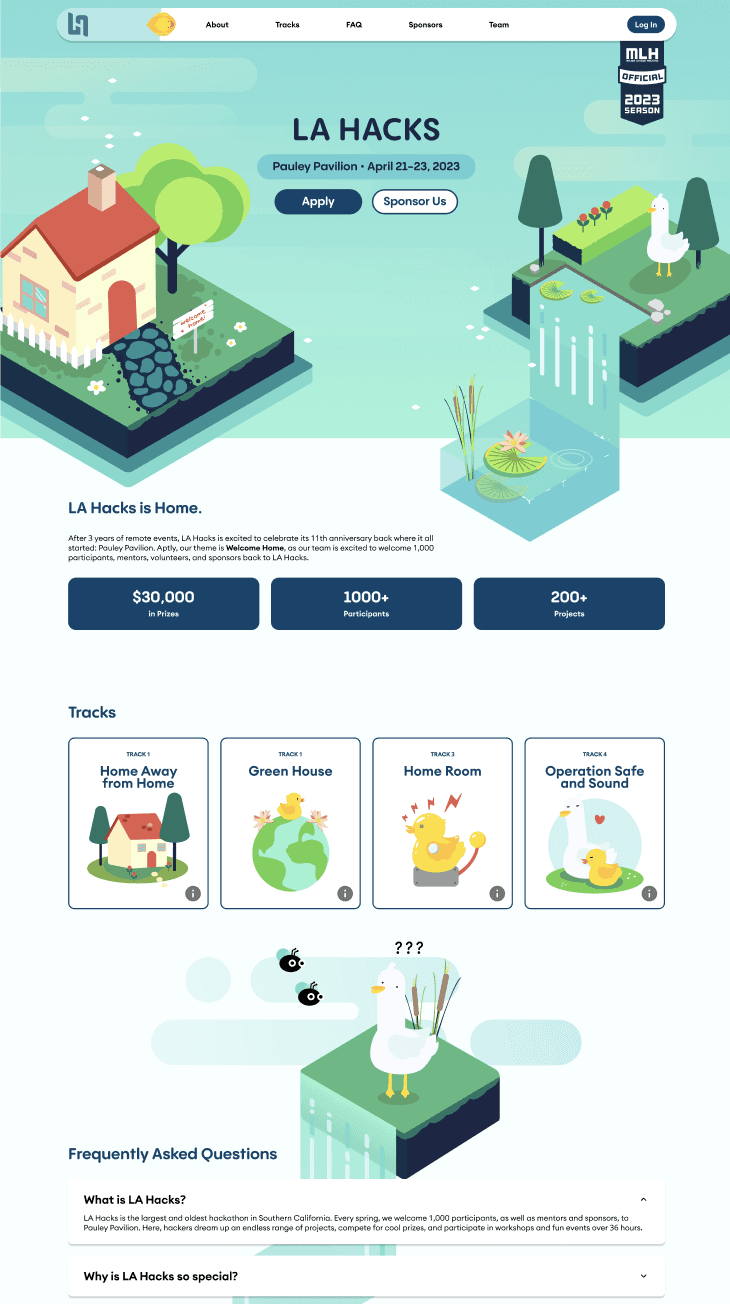
Home page site for hackers to visit before and during the hackathon
IMPACT
130% INCREASE
in hacker applications
98% OF HACKERS
rated the application as improved
28% DECREASE
in attendee churn rate
REFLECTION
Iteration beats “good enough”
Great design emerged through constant refinement. This project reinforced that deadlines matter, but iteration is what helped us ultimately elevate quality.
Documentation is a design deliverable
Clear Figma documentation — components, states, and flows — was essential for developer alignment and long-term maintenance of the three different sites.